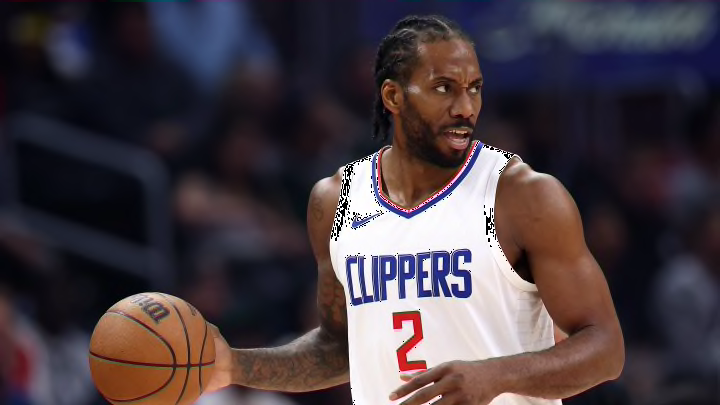
The New Clippers Uniforms Are Actually Alright
By Liam McKeone

On Monday the Los Angeles Clippers revealed their redesigned jerseys and logos by way of a Zach Lowe exclusive on ESPN.com. With the team set to move to their new stadium this summer in Inglewood, titled the Intuit Dome, Los Angeles wanted some fresh threads and colors to welcome the new era of Clippers basketball. The last time they did this, a few years ago to mark the beginning of the Steve Ballmer regime, everyone made fun of them because it's easy to make fun of change and there wasn't really anything interesting about the jerseys. From the logo change to the color scheme switch-up, things were bland.
Ballmer is anything but and clearly wanted to avoid such accusations this time around. The Clippers have cooked up a brand-new logo to go with fresh jerseys. And you know what? They're actually pretty good. Bold in that it's new but not so bold that it feels like they're changing things up for the sake of change. Basically everything you'd cautiously hope for in a franchise redesign. None of it is perfect but it is definitely an improvement.
The Clippers unveil new jerseys and logo for next season 🔥
— Bleacher Report (@BleacherReport) February 26, 2024
(via @LAClippers) pic.twitter.com/HVHVmYlQk8
I am a big fan of the new logo in particular. At first I was sour on it because I thought it looked too much like a cruise ship but as soon as it is pointed out that the upper "levels" of the ship are actually sails you can't see it any other way. It's definitely a clipper ship, and it is pretty neat. The cursive lettering is far more crisp than the previous iterations. And I really love the red jerseys. A deeper shade than the Houston Rockets' unis and it goes great with the navy blue.
Now, do they kind of look like Washington Wizards jerseys at first glance? For sure. But that kind of goes into what I said above. These are different but not off the beaten path at all, for better and for worse. Veering away from tried-and-true pattern and color combinations can lead to some heinous results but can also lead to greatness. The Clippers played it safe while still changing enough that it feels new, which is probably the ideal middle ground for a multi-billion dollar franchise.
After seeing the absolute catastrophe unfolding in Major League Baseball with the uniform thing last week I think we all have a deeper appreciation for a solid jersey when we see it. And that's what the Clippers have done here-- made a solid jersey. A solid logo. A solid new court, as you can see in the Lowe article above. Yeah, it's nothing crazy and some people won't like it, but you won't be groaning or be tempted to shield your eyes when they show up on the screen.
Sometimes, just good is good enough. The Clippers have hit that mark here.